Long time readers of Future Fire may remember my second ever post was about a review paper. The paper was many things, including a very useful summary of recent planetary trends in fire, fire drivers and the predicted impacts of climate change on both. For our purposes today, the chief attribute of the paper was that it was ridiculously big and ridiculously ambitious.
It should have come as no surprise then, when I got an email from the review paper’s lead author Matt Jones in March this year, declaring his intention to write a State of Wildfires report along with co-leads Doug Kelley, Chantelle Burton and Francesca Di Giuseppe. Nothing out of the ordinary, really, just
A catalogue of Earth’s extreme individual wildfires or extreme wildfire seasons of the past 12 months,
An interpretation of the last year’s events in the context of recent trends,
A deep dive on a limited number of ‘focal extremes’ with notable impacts on society or the environment, including:
A diagnosis of the influences of fuel dryness, fuel load, ignitions and suppression on each focal extreme;
An assessment of the capacity of state of the art predictions to forecast each focal extreme;
An assessment (‘attribution’ in the jargon) of the influence of climate change and land use on each focal extreme;
A projection of future changes in the probability of each focal extreme under future climate scenarios and
An outlook on the probability of extreme events in the coming fire season.
Oh, and the whole thing was to be drafted and submitted within two months of Matt’s email (Ziff!*). And accompanied by a storm of comms materials to increase the reach and impact of report. And then repeated again next year, and every year after that.
There I was, thinking that a simple global analysis of forest fire activity as a function of atmospheric demand for water, today and under climate change, was a big deal. Ah, my sweet autumn child. There’s levels to this.
~~~~~~~~~~~~~~~~~~~~~~~~~~~~~~~~~~~~~~~~~~~~~~~~~~~~~~~~~~~~~~~~~~~~~~~~~~~~
What did surprise me was that along with Matt’s email about his casual plan to write a report about every fire on the planet that year, was an invitation for yours truly to serve as one of two regional experts for the Australasia region. Regional experts were tasked with adding some local knowledge to help understand the meaning of the numbers reported in the body of the report. I shared this honour with the Victorian CFA’s fire and climate supremo, Sarah Harris.
Three months later (and they said two months! Pfft) the whole thing was submitted. A short while after that (August 14 to be precise) the State of Wildfires 2023-24 was published, in all its glory, albeit with a slightly expanded author list than that original email:
Matthew W. Jones, Douglas I. Kelley, Chantelle A. Burton, Francesca Di Giuseppe, Maria Lucia F. Barbosa, Esther Brambleby, Andrew J. Hartley, Anna Lombardi, Guilherme Mataveli, Joe R. McNorton, Fiona R. Spuler, Jakob B. Wessel, John T. Abatzoglou, Liana O. Anderson, Niels Andela, Sally Archibald, Dolors Armenteras, Eleanor Burke, Rachel Carmenta, Emilio Chuvieco, Hamish Clarke, Stefan H. Doerr, Paulo M. Fernandes, Louis Giglio, Douglas S. Hamilton, Stijn Hantson, Sarah Harris, Piyush Jain, Crystal A. Kolden, Tiina Kurvits, Seppe Lampe, Sarah Meier, Stacey New, Mark Parrington, Morgane M. G. Perron, Yuquan Qu, Natasha S. Ribeiro, Bambang H. Saharjo, Jesus San-Miguel-Ayanz, Jacquelyn K. Shuman, Veerachai Tanpipat, Guido R. van der Werf, Sander Veraverbeke, and Gavriil Xanthopoulos
True to Matt’s form, the final report clocked in at a hefty 85 pages. Fear not, because if that doesn’t satisfy your craving for knowledge, the supplementary material contains an additional 61 pages of material. Here’s the first page of the report and the last page of supplementary material. You can fill in the blanks.
~~~~~~~~~~~~~~~~~~~~~~~~~~~~~~~~~~~~~~~~~~~~~~~~~~~~~~~~~~~~~~~~~~~~~~~~~~~~
I clearly can’t do justice to the whole report, but I will take you through a few highlights.
Thanks to the miracle/curse of the Information Age - and specifically, a couple of fancy satellite sensors known as MODIS - we are now in a position to be aware of pretty much every single active fire on the planet (at once).
Actually that’s not strictly true - note this hefty disclaimer
We note that the MODIS BA [burned area] product data used in our analyses of anomalies in BA and individual fire properties (via the Global Fire Atlas) are known to be conservative due to the limitations to detecting small fires (e.g. agricultural fires) based on surface spectral changes at 500m resolution. Recent work has shown that including detections of small active fires increases global BA estimates by 93% (Chen et al., 2023). However, variability and trends in regional BA totals using datasets that include small fires do not differ significantly from the variability and trends present in the MODIS BA product (Chen et al., 2023). Hence, inclusion or exclusion of small fires tends to generate biases in central estimates of BA in one direction or the other, in line with the sensitivity of different sensors to different fire types. Uncertainty in the detection of small fires is larger than in the case of fires detected in the MODIS BA product, due to limited validation (van der Werf et al., 2017). The MODIS BA product with resolution of 500m is deemed highly suitable for addressing the research questions of this report, which focus on more impactful fires that tend to burn larger areas.
So what did all this remote sensing tell us? Well, first of all, almost four million square kilometres of terrestrial vegetation burnt between March 2023 and February 2024 (defining a global fire season isn’t trivial, but that window was our best compromise).
How much is 4m km2? It’s big!
400 million hectares
1 billion acres
Four trillion square metres
1 billion football fields, in case you like the idea of seeing a bunch of sporting infrastructure go up in flames. If you prefer to burn water, it’s 4 billion Olympic swimming pools.
It’s more than half the area of Australia, well over ten times the area of New Zealand, just under 100 times the area of Tasmania and about 400 times the size of the Greater Blue Mountains area I used to call home.
It’s 400 Gospers. (The Gospers Mountain mega-blaze during the Black Summer season of 2019-20 is the biggest that we know of in that corner of the world and it burned one million hectares.) This is a bit unfair, because a lot of the global burned area isn’t in forests, it’s in savannahs, grasslands and the like. Don’t take my word for it though: “…the African grassland, savannah, and shrubland biome… contributes 58% towards the global total BA [burned area] in the average year...”
Or is 4m km2 big???
It’s less than 1% of the surface area of our dear old pale blue dot.
It’s a tick under 3% of the planet’s total land surface. Not all of this land is covered with flammable vegetation, so that fraction of burnable land is a bit higher.
If we forget last year and look over a longer stretch, and break it down by region, we can see that around 7% of Africa burns each year, 4% of Oceania (Australia says hi!), 3% of South America, 1% of Asia and a bit less than that for Europe and North America.
What if we compare 4m km2 to… itself? Sorry, I’m not being clear. What I mean to say is that four million square kilometres is just below the average burned area over the previous 22 global fire seasons. So a rather ‘meh’ year globally.
~~~~~~~~~~~~~~~~~~~~~~~~~~~~~~~~~~~~~~~~~~~~~~~~~~~~~~~~~~~~~~~~~~~~~~~~~~~~
Let’s take a look at some of the figures. I’ll use the figure number from the report, rather than starting from scratch here. Figure 2 shows how burnt area last year ranked compared to the last 20 or so years. Note the legend, which highlights areas with particularly high or low rankings for last year. Results are broken down by a) continental biome, b) country, and c) ‘global administrative region’. What jumps out at you?

~~~~~~~~~~~~~~~~~~~~~~~~~~~~~~~~~~~~~~~~~~~~~~~~~~~~~~~~~~~~~~~~~~~~~~~~~~~~
Ok fine. That’s burnt area. What else can this whiz bang satellite imagery tell us? Glad you asked, because Figure 4 shows us how last year ranked compared to the previous couple of decades for a) number of fires, b) 95th percentile fire size and c) 95th percentile rate of growth. Same legend as before. Wow, that’s a lot of detail! Note that these are the Global Administrative Regions which you’ll recall from the third panel of Figure 2 above. Again, what jumps out at you?

~~~~~~~~~~~~~~~~~~~~~~~~~~~~~~~~~~~~~~~~~~~~~~~~~~~~~~~~~~~~~~~~~~~~~~~~~~~~
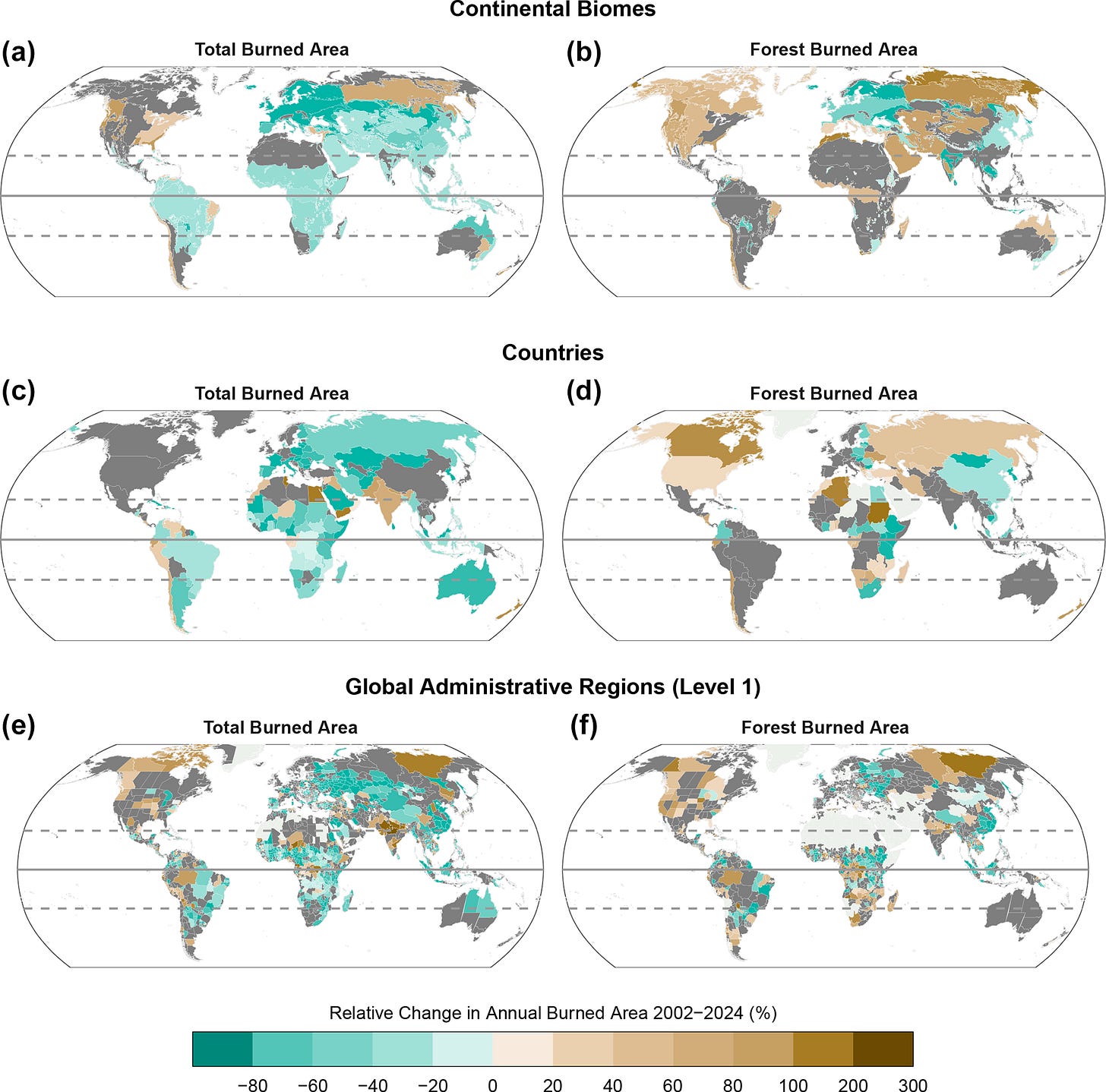
Alright, the above two figures gave us a simple rank i.e. where did last year slot in the all time record (again, noting the short time period of satellite imaging!). What about something different? Are there any trends over the last 22 years? Let’s limit ourselves to burned area rather than the fancy measures in Figure 4, and let’s split it up into total burned area (left hand side) and burned area specifically in forests (right hand side). Again, with the breakdowns by continent (top), country (middle) and admin region (bottom). Behold, Figure 5.
What jumps out? Are you SHOCKED by the lack of trends in Australia? Slow your roll. We need to be careful drawing conclusions from such a short time period. For savannahs and other areas where the same patch of land/vegetation might burn every year or two, a 20 year record is not bad for trend analysis. For other places, like my former home in the Blue Mountains west of Sydney, any given patch of bush is not prone to being burnt annually - more like every 10 or 20 or 50 years. Trend detection in places like that is not impossible but it’s harder. Which is why those trends in boreal forests are particularly notable…
You can even go and explore all the data yourself!
Maps are here https://climate.uea.co/State-of-Wildfires-Map/
Timeseries are here https://climate.uea.co/State-of-Wildfires-Timeseries/
~~~~~~~~~~~~~~~~~~~~~~~~~~~~~~~~~~~~~~~~~~~~~~~~~~~~~~~~~~~~~~~~~~~~~~~~~~~~
Phew! That’s the ‘snapshot’ part of the report, which to my mind is the meat (or tofu) of it. But some seriously fancy science comes in next, as the modelling crew take a deep dive on extreme events. Remember those ‘focal extremes’ from the top of this post, that you read two hours ago? A whole bunch of analyses related to these extremes fill the remainder of the report.
So what are the extremes?
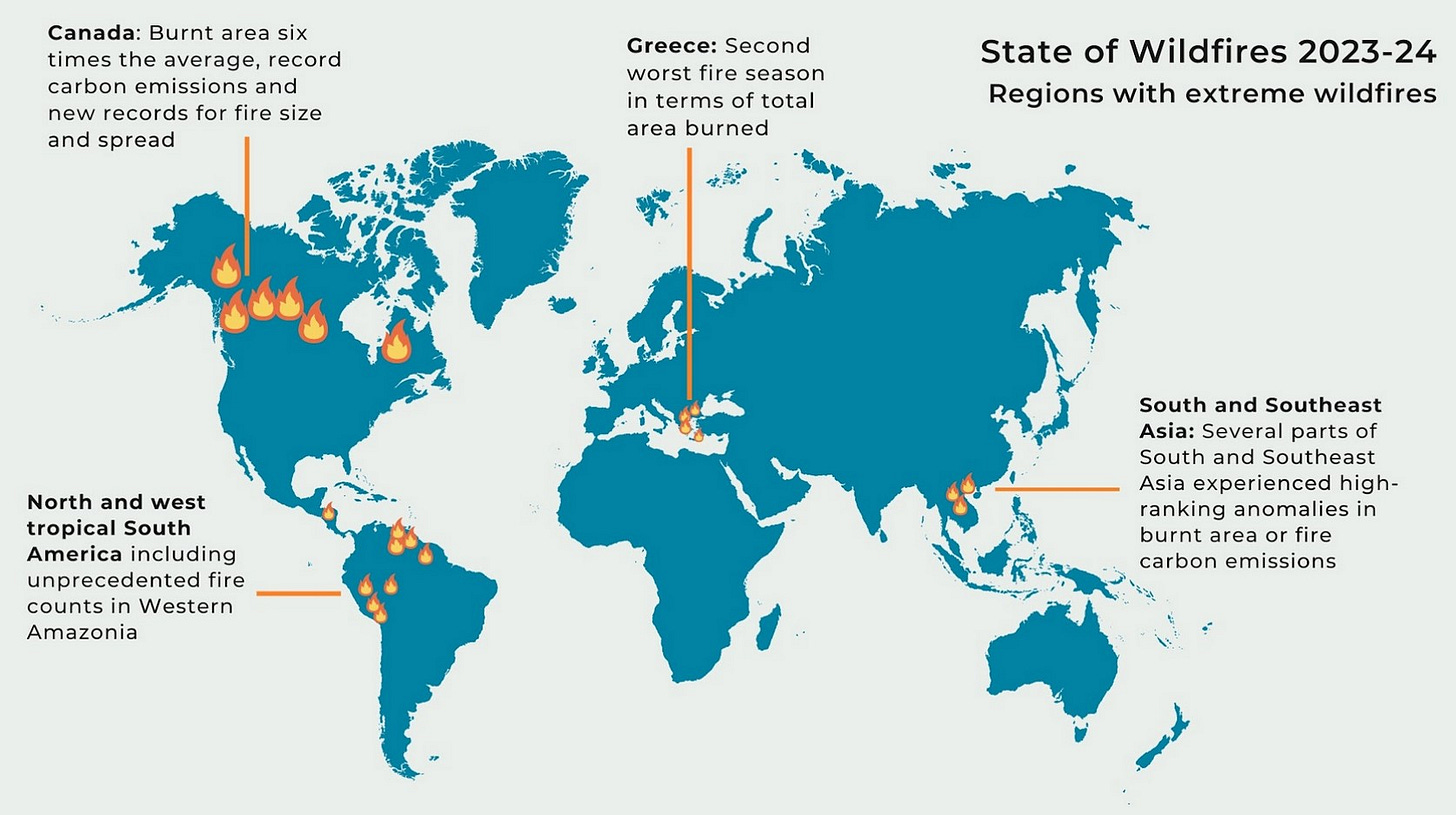
Notable events included record-breaking fire extent and emissions in Canada, the largest recorded wildfire in the European Union (Greece), drought-driven fires in western Amazonia and northern parts of South America, and deadly fires in Hawaii (100 deaths) and Chile (131 deaths).
These extremes are a somber reminder of the toll that wildfires can take. Some of them are encapsulated in the infographic below. But really, there’s a limit to what they can convey. We really need a State of Wildfires - Artist’s Rendition to accompany the regular report, where people who know how to mainline into your emotions and id (like marketers or David Lynch) develop materials to convey the magnitude and meaning of all these numbers and graphs.

Some of the fancy modelling I just alluded to is summarised in another infographic from the report below, which shows the estimated contributions from different sources to those extreme fires. The mysterious category ‘Other’, shown in grey, refers to things like firefighting (aka suppression) and landscape fragmentation (e.g. from agriculture, forestry and settlements), which can alter fire behaviour and spread. You’re probably quite tired by now, so I won’t expect anything to jump out at you. Other parts of the analysis did, as promised, cover predictability lead times, climate change attribution, seasonal outlooks and climate change projections.
~~~~~~~~~~~~~~~~~~~~~~~~~~~~~~~~~~~~~~~~~~~~~~~~~~~~~~~~~~~~~~~~~~~~~~~~~~~~
It’s getting late so let me leave you with a few final thoughts:
It was an honour being invited, good fun participating and awe inspiring seeing the thing come together so quickly.
Readers interested in Australia and surrounds should go to page 54 of the main report, where Sarah and I wrote a little bit about the picture here, with more than a little support from fire managers and data custodians in each State and Territory.
Australia did not feature in the ‘focal extreme’ section this year. Stay tuned for future editions.
Impacts do not necessarily scale with size, speed. Big fires can be relatively benign, and small ones can be devastating. That makes a report like this difficult.
Overall I think this is a great start. It’s clear, comprehensive and might help us collectively build some intuition about large-scale fire patterns (pyracy, anyone? You know, like numeracy and literacy?).
But there’s a long way to ago. As just noted, fire means more than just the area it burns. Much more. The meanings are many and manifold and multitudinous. For a start, it would be interesting to consider a social and policy dimensions section.
Will it make a difference to how we see or manage fire? I hope so. But noting the slowly chugging 200 carriage train of IPCC reports that has been dumping waves of incredible science on our heads for decades, but cannot seem to dent emissions, I can’t say I’m confident that a report on its own will move the needle.
What will move the needle? Well, to find out you’ll have to wait for the release of State of Needles 2024-2025 (manuscript in preparation).
*Ziffer. Noun. Someone who, upon seeing something unrealistic happening in a movie, reacts by calling out ‘Ziff!’. (Contraction of ‘as if!’, coined by Lano and Woodley).


Firstly, congratulations on being included in such a publication! Kudos! Great work trying to summarise the summary - and yet my brain still hurts! That's why 'marketers or David Lynch' actually have an important role to play...and why the volumes of IPCC reports go unnoticed, sadly.